Support us

Guidelines color blind friendly figures


An introduction to color blindness

Color blindness or color vision deficiency means to have a decreased ability to see differences between colors or - in rare cases - to see colors at all. There are several different types of color blindness of which red-green vision deficiency is the most common type. You can get a visual demonstration of the different deficiencies on this website. 


It is good practice to make sure your graphs and images are readable by color blind readers. Some journals, like Nature, also strongly encourage having color blind safe figures.

Creating color-blind-friendly graphs
First, consider what type of data you want to show. There are generally three different types:

  • Qualitative: the variable consists of distinct categories (e.g. marital status, cell type)
  • Sequential: the variable can have a range of values from low to high
  • Diverging: the variable has a distinct 0-point and can have values higher and lower compared to the 0-point.

This website by Paul Tol has several categorical, sequential and diverging color blind friendly schemes. 
ColorBrewer is an interactive tool that can provide schemes for your figures (find how to use ColorBrewer at the end of this document).

Qualitative color schemes

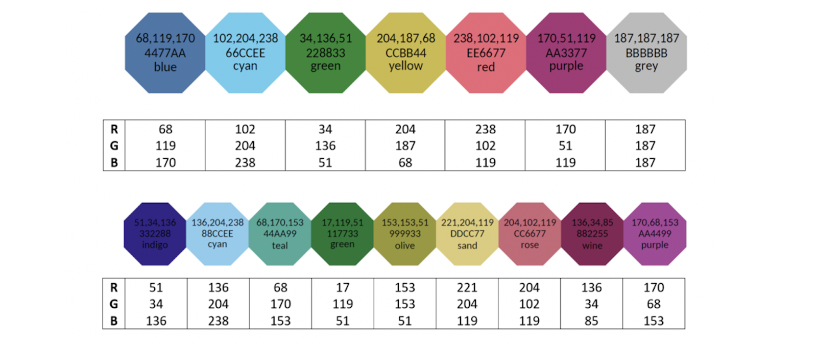
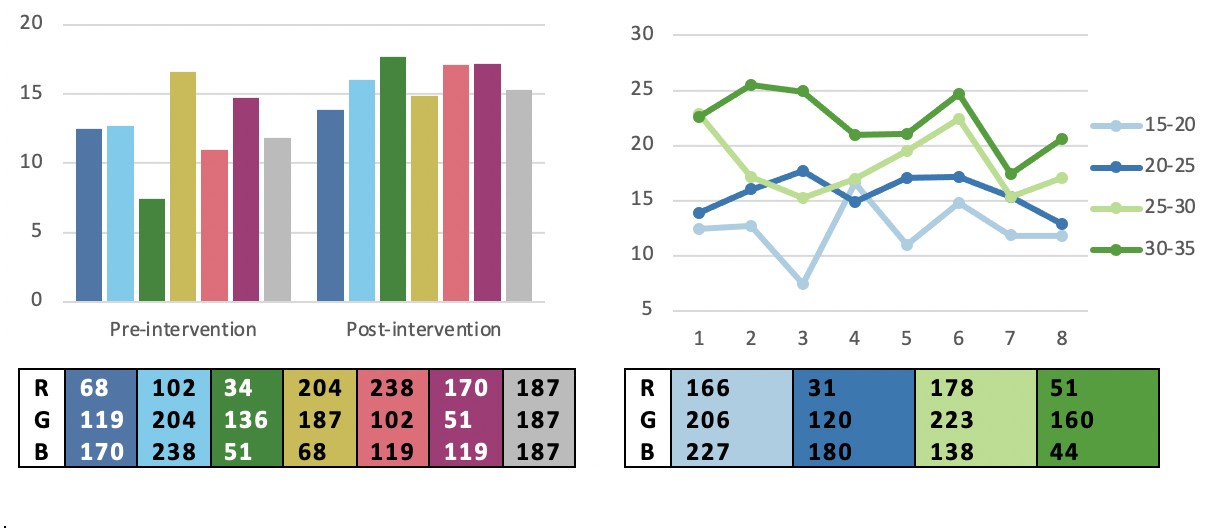
Below are examples of figures with color blind safe qualitative data with their RGB-values.
More palettes with different numbers of categories can be found at the end of this document, on Paul Tol’s website and using ColorBrewer.

Sequential & diverging

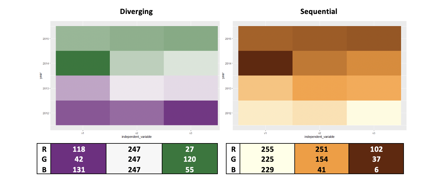
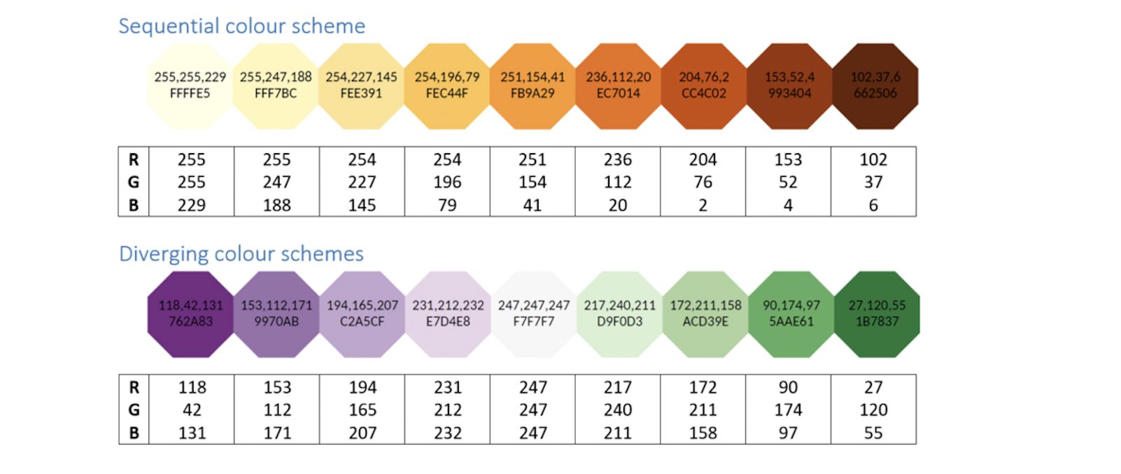
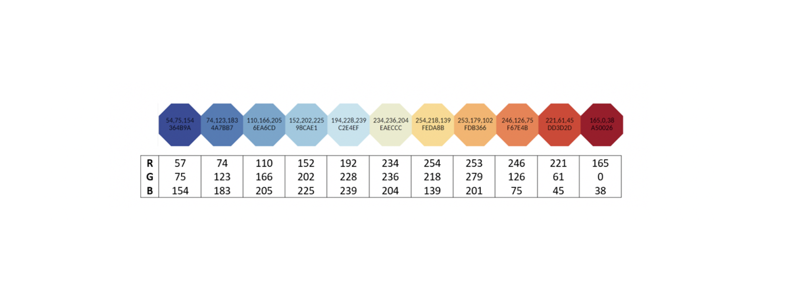
Below are examples of heat maps with colour vision deficiency safe sequential and diverging colour palates with the RGB-values.
You can find more palettes at the end of the document, on Paul Tol’s website or using ColorBrewer (find how to use ColorBrewer at the end of this document).

For sequential palettes with continuous data (e.g. heat maps) using the lowest, middle, and highest values of the palettes, gives a decent approximation of the color palette.

Creating color blind friendly microscope images

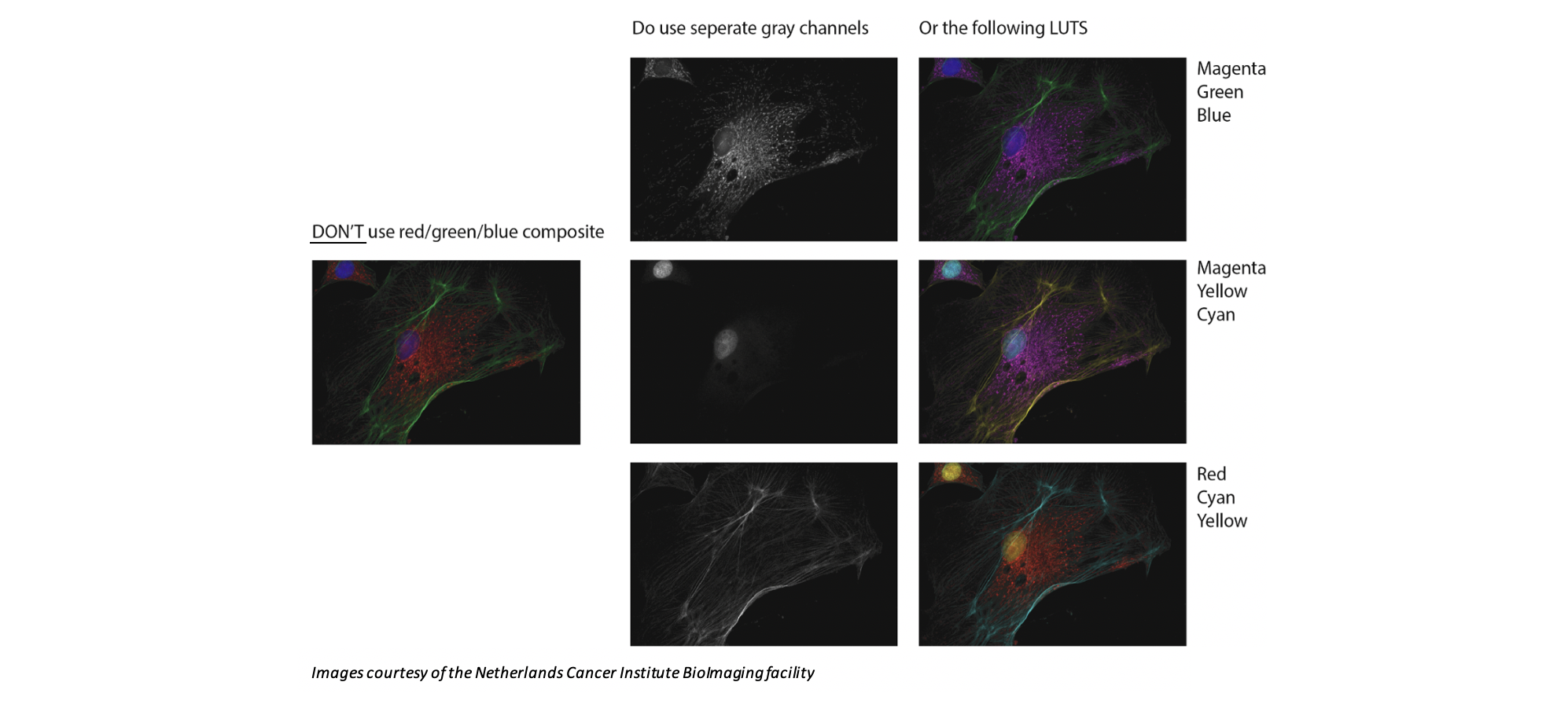
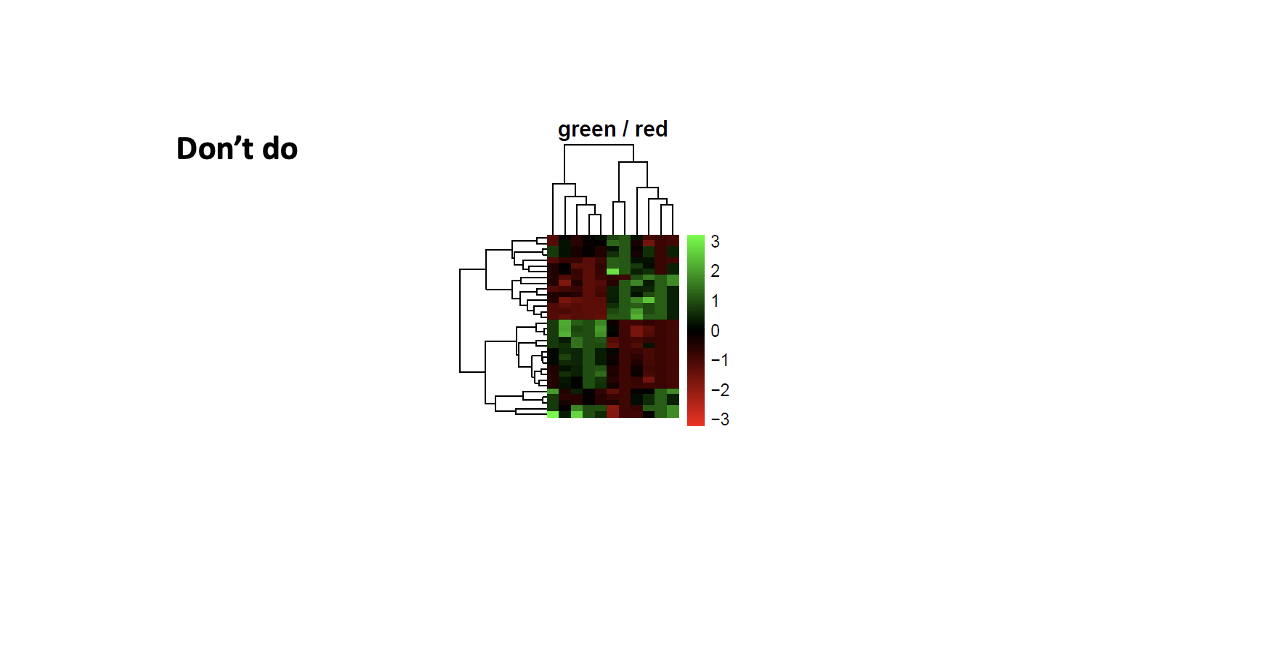
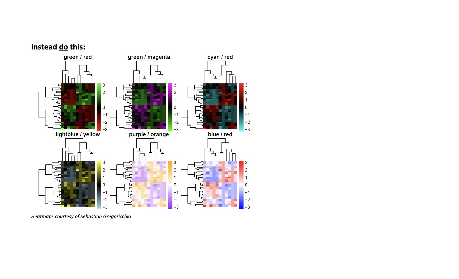
The classic red/green combination is the least distinguishable in the most common forms of color vision deficiency.

To make sure your fluorescent images are color-vision deficient friendly:

  • Best practice: Show greyscale images for every individual channel next to a merged image
  • Alternative to two-color images: Green/Magenta, Yellow/Blue, Red/Cyan
  • Alternative to three-color images: Magenta/Yellow/Cyan, Magenta/Green/Blue, Red/Cyan/Yellow
  • Alternative to four-color images: Magenta/Yellow/Green/Blue

Making color blind friendly figures

Many programs already have built-in tools to help you design accessible figures. Often, grayscale is converted to color with the use of LookUpTables (LUTs), which couple specific RGB values to grayscale for conversion. Other tools include color blindness simulators. There is a lot of information to be found for specific programs, by searching for LUTS, palettes, or settings.

A few examples:

  • Fiji / ImageJ: LUT Turbo, download the .lut file and add it to your list of LUTs.
  • General/Photoshop: Use Adobe Color to check if your colors are safe. Adobe users can save the theme and use them in Photoshop, Illustrator, etc.
  • PRISM / Graphpad: Right-click on graph > Define color scheme > Colorblind safe
  • CARTO: Cartocolors scheme ‘Safe’
  • R / R Studio: library(RColorBrewer) followed by display.brewer.all(colorblindFriendly = T)

Check whether your images are color-vision deficient friendly:

  • In ImageJ: Image > Color > Dichromacy or Image > Color > Simulate Color Blindness
  • Photoshop: View > Proof Setup > Color Blindness
  • Color Oracle: http://colororacle.org/
  • Mac / IOS: Settings > Accessibility > Display > Colour filters

General tips to improve visualization

Besides using color blind-safe colors, there are other methods to enhance the readability of your figures in general. Here are a few suggestions:

  • Instead of colors you can use patterns, shapes, etc. This has the added advantage that it doesn’t matter if the figures are printed in color or in grayscale.
  • Keep your legend in the same order as your data or directly connect your labels to your data.
  • The more colors you use there is less differences between the colors and thus more difficult to differentiate between them. Try to use as few categories as possible.

Qualitative color schemes

All images courtesy of Paul Tol, you can find more images on their website
                            Instead do this

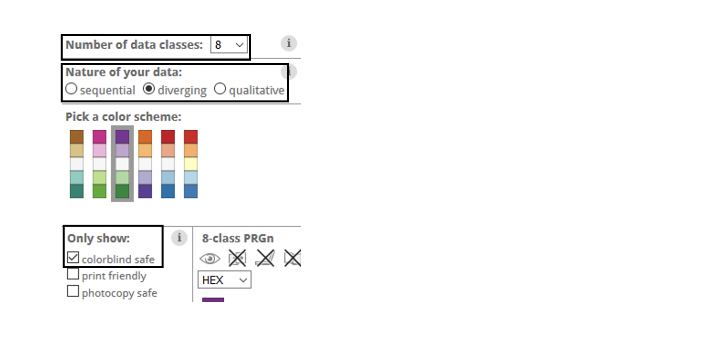
Using ColorBrewer:

Maximum number of colours using ColorBrewer:

  • 4 for qualitative
  • 9 for sequential
  • 11 for diverging

    To use ColorBrewer, make sure you have set: 
  • “Number of data classes” to the number of colours you need
  • “Nature of your data” to the data type you have (qualitative, sequential or diverging)
  • “colorblind safe” in the options on the left side

This site uses cookies

This website uses cookies to ensure you get the best experience on our website.